What's in a logo?
Here at ProActive we are going through some exciting changes. Recently we decided on a new logo to represent us. We will begin implementing it over the next few weeks.
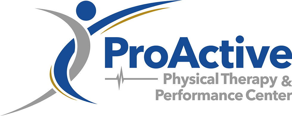
What is in a logo? Below is the brand new logo:

On the far left of the logo is a representation of a flowing, active individual. There are left and right halves of the individual indicating our appreciation of the left and right halves of the body as well as the inherent, balanced asymmetry of the body. The flowing lines indicate an active, ProActive lifestyle moving forward and positively in life. The intertwining flow of the graphic represents our appreciation of integration of the body's systems, and thus our respect for integration of multiple disciplines and their role in an individual's well-being.
The "heart-beat" is carried over from the original logo as a reminder of our roots and our past, as well as a representation of the performance aspect of the clinic. The line continues on to the right to remind us not be be stuck in the past, rather, continue to move forward in to the future ProActively.
The font of the logo is chosen as a timeless, focused font. It is a reminder for us not to get stuck in fads, but rather stay focused on our foundation knowledge and practices. It is clear and to the point, something we hope our interventions are for our patients. The timeless font is a representation of the importance of the enduring nature of physical therapy practice and the boundless benefits of physical therapy.
The gold accent is a representation of prosperity. Prosperity is the state of flourishing, thriving, and good fortune. Gold is also the color of optimism and positive thinking. We whole-hardheartedly believe that a proper, ProActive approach to your health and well being will lead to a positive, prosperous life.
Blue is the color of trust, honesty, and loyalty. It indicates reliability and responsibility. Blue reduces stress, creating a sense of calmness and promoting physical and mental relaxation. It is a tribute to our respect to the parasympathetic system and our goal of contributing to autonomic nervous system balance for the body. When you associate blue with us we hope it increases your trust in what we do.
Silver signals self reflection and opens doors as it illuminates the way forward and in to the future. It represents our forward thinking mentality as we advance in the future of health care and ProActive interventions. Silver is calming, soothing, and often represents self control. Silver is necessary as we transition in to a new, exciting chapter of the future of our organization.
We look forward to continuing on this journey of health and wellness with you so that you can have a positive, prosperous life.
Be ProActive. Prosper.


